

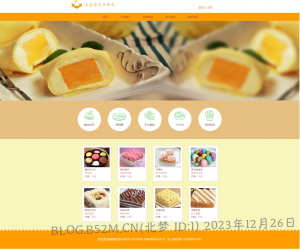
题目:西式甜品网
一、语言和环境
二、页面设计
![图片[1]-2023上半年试卷A(西式甜品网)_个人解题过程](https://wpstatic.b52m.cn/wp-content/uploads/2023/12/20231226-1024x852.png)
三、要求
使用HTML5 + CSS3完成页面设计,要求HTML代码和CSS代码分离。
四、推荐实现步骤
1、页面头部分:
![图片[2]-2023上半年试卷A(西式甜品网)_个人解题过程](https://wpstatic.b52m.cn/wp-content/uploads/2023/12/20231226-2-1024x44.png)
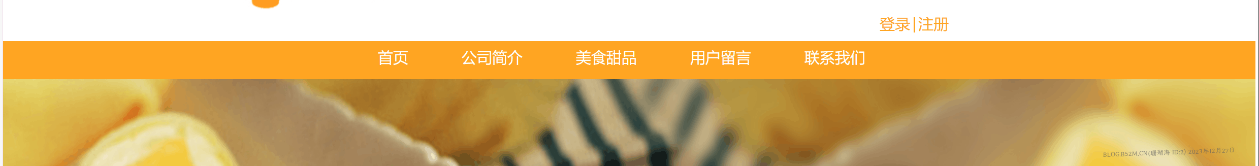
2、导航栏:
![图片[3]-2023上半年试卷A(西式甜品网)_个人解题过程](https://wpstatic.b52m.cn/wp-content/uploads/2023/12/20231226-3-1024x35.png)
3、导航栏悬浮特效:
![图片[4]-2023上半年试卷A(西式甜品网)_个人解题过程](https://wpstatic.b52m.cn/wp-content/uploads/2023/12/20231226-4.png)
4、横幅部分:
![图片[5]-2023上半年试卷A(西式甜品网)_个人解题过程](https://wpstatic.b52m.cn/wp-content/uploads/2023/12/20231226-5-1024x266.jpg)
5、甜品类别部分:
![图片[6]-2023上半年试卷A(西式甜品网)_个人解题过程](https://wpstatic.b52m.cn/wp-content/uploads/2023/12/20231226-6-1024x131.png)
6、甜品展示部分
![图片[7]-2023上半年试卷A(西式甜品网)_个人解题过程](https://wpstatic.b52m.cn/wp-content/uploads/2023/12/20231226-7-1024x322.png)
7、脚部分
![图片[8]-2023上半年试卷A(西式甜品网)_个人解题过程](https://wpstatic.b52m.cn/wp-content/uploads/2023/12/20231226-8-1024x70.png)
五、注意事项
- 仔细审题,把题目要求理解准确;
- 请注意按照界面的设计要求来进行页面设计;
- 请注意代码的书写、命名规范和适当的注释。
- 必须使用外部样式表,否则扣除文件规范部分内容分数
- 提交文件夹,以学号姓名进行命名,如:200301001张三
- 文件夹中内容必须规范完整,保护页面,素材和样式表
五、评分标准
- 页面布局 35分
- 页面头部 5分
- 导航栏及悬浮特效20分
- 导航栏 15分
- 悬浮特效 5分
- 横幅 5分
- 甜品类别 10分
- 甜品展示 15分
- 页面底部 5分
个人解题思路
纯小白,大佬勿喷,有不对的可以指出
1.先根据第二点页面设计来分析出网页大概轮廓,确定宽高
确定大概由多少个大容器组成,直接写出容器,并设置宽高,在加一个背景便于显示,后期删除
html
<!DOCTYPE html>
<html lang="en">

<head>
    <meta charset="UTF-8">
    <meta name="viewport" content="width=device-width, initial-scale=1.0">
    <title>Document</title>
    <link rel="stylesheet" href="css/style.css">
</head>

<body>
    <!-- 头部开始 -->
    <div class="header"></div>
    <!-- 导航栏 -->
    <div class="nav"></div>
    <!-- 横幅 -->
    <div class="streamer"></div>
    <!-- 类别 -->
    <div class="form"></div>
    <!-- 展示 -->
    <div class="show"></div>
    <!-- 页脚 -->
    <div class="footer"></div>
</body>

</html>
css
* {
    /* 清除网页内外边距 */
    margin: 0;
    padding: 0;
}

.header {
    width: 100%;
    height: 72px;
    background: white;
}

.nav {
    width: 100%;
    height: 46px;
    background-color: #ff9c00;
}

.streamer {
    width: 100%;
    height: 494px;
    background-color: #f7f5bc;
}

.form {
    width: 100%;
    height: 210px;
    background-color: #e7bf81;
}

.show {
    width: 100%;
    height: 550px;
    background-color: #f7f5bc;
}

.footer {
    width: 100%;
    height: 110px;
}
2.大概做出来了,接下来就从上到下开始写
先创建了一个div,用这个div来实现居中,再创建了两个div一个放图片,一个放注册登录的文字
html
<!-- 头部开始 -->
<div class="header">
    <!-- 设置头部显示内容 -->
    <div class="header-box">
        <!-- 设置头部logo图片 -->
        <div class="logo"><img src="img/logo.jpg" alt="logo"></div>
        <!-- 设置注册登陆文字 -->
        <div class="login"><a href="#">登陆</a> | <a href="#">注册</a></div>
    </div>
</div>
css
.header {
    width: 100%;
    height: 72px;
    background: white;
}

.header-box {
    /* 设置宽度占据页面的75%,相对好看一点 */
    width: 75%;
    /* 水平居中 */
    margin: auto;
    /* 设置弹性布局 */
    display: flex;
}

a {
    /* 去除下划线 */
    text-decoration: none;
}

.login a {
    /* 将登陆注册和|设置为橙色 */
    color: #ff9c00;
}

.logo {
    /* 让logo的容器占据header-box的一半,实现平分 */
    width: 50%;
}
3.导航栏界面
用无序列表,先创建一个div,实现元素居中,然后再写列表,把列表的点去掉并横向排序
html
<!-- 导航栏 -->
<div class="nav">
    <!-- 设置导航栏盒子 -->
    <div class="nav-box">
        <ul>
            <!-- 使用列表创建导航栏 -->
            <li><a href="#">首页</a></li>
            <li><a href="#">公司简介</a></li>
            <li><a href="#">美食甜品</a></li>
            <li><a href="#">用户留言</a></li>
            <li><a href="#">联系我们</a></li>
        </ul>
    </div>
</div>
css
.nav {
    width: 100%;
    height: 46px;
    background-color: #ff9c00;
}

ul {
    /*去点*/
    list-style: none;
}

.nav-box {
    width: 600px;
    /* 居中 */
    margin: auto;
}

.nav-box a {
    color: #c56f08;
}

.nav-box li:hover {
    background: #4dbaf3;
}

.nav-box ul li {
    /* 设置左浮动 */
    float: left;
    width: 120px;
    height: 46px;
    /* 水平垂直居中 */
    text-align: center;
    line-height: 46px;
}
4.横幅图片
直接插入了一张图片,然后设置宽高占据元素100%
html
<!-- 横幅 -->
<div class="streamer">
    <!-- 显示图片 -->
    <img src="img/banner.jpg" alt="banner" width="100%" height="100%">
</div>
css
.streamer {
    width: 100%;
    height: 494px;
}
5.类别
一样设置一个最外层div实现居中,然后内部使用一个div来排列每个元素的位置,图片与文字使用的是绝对定位与相对定位,实现文字在图片上
绝对定位与相对定位,设置父元素的css属性为相对定位position: relative,设置子元素为position: absolute,最后子元素就可以使用top,left…设置元素的位置了
html
<!-- 类别 -->
<div class="form">
    <!-- 设置最外层盒子 -->
    <div class="form-box">
        <!-- 设置内部图片及文字 -->
        <div class="form-box-bg">
            <img src="img/list1.png" alt="list1">
            <p>提拉米苏</p>
        </div>
        <div class="form-box-bg">
            <img src="img/list2.png" alt="list2">
            <p>甜甜圈</p>
        </div>
        <div class="form-box-bg">
            <img src="img/list3.png" alt="list3">
            <p>芝士蛋糕</p>
        </div>
        <div class="form-box-bg">
            <img src="img/list4.png" alt="list4">
            <p>马卡龙</p>
        </div>
        <div class="form-box-bg">
            <img src="img/list5.png" alt="list5">
            <p>西式甜点</p>
        </div>
    </div>
</div>
css
.form {
    width: 100%;
    height: 210px;
    background-color: #e7bf81;
}

.form-box {
    /* 设置元素水平居中 */
    display: flex;
    /* 将弹性盒子内的元素在水平方向上居中对齐 */
    justify-content: center;
}

.form-box-bg {
    /* 设置左浮动 */
    float: left;
    /* 父元素设置相对定位 */
    position: relative;
    margin-left: 40px;
    margin-top: 30px;
}

.form-box-bg img {
    width: 100%;
}

.form-box-bg p {
    /* 子元素设置相对定位 */
    position: absolute;
    /* 文字居中 */
    text-align: center;
    width: 100%;
    /* 设置文字距离父元素底部的距离 */
    bottom: 20px;
    color: #8d7668;
}
6.展示
创建最外层div实现居中,因为元素格式都一样,所以只需要设置一个即可实现全部的布局效果
html
<!-- 展示 -->
<div class="show">
    <!-- 设置展示页外层盒子 -->
    <div class="show-c">
        <!-- 每个内容显示的盒子 -->
        <div class="show-box">
            <!-- 设置内部内容 -->
            <div class="show-box-body">
                <!-- 图片 -->
                <img src="img/con1.jpg" alt="con1">
                <!-- 显示内容 -->
                <p>爱的N次方</p>
                <p>
                    <font color="pink">马卡龙</font>
                </p>
                <p>价格:<font color="pink">30元</font>
                </p>
            </div>
        </div>
        <div class="show-box">
            <div class="show-box-body">
                <img src="img/con2.jpg" alt="con2">
                <p>果肉果冻</p>
                <p>
                    <font color="pink">双色马卡龙</font>
                </p>
                <p>价格:<font color="pink">30元</font>
                </p>
            </div>
        </div>
        <div class="show-box">
            <div class="show-box-body">
                <img src="img/con3.jpg" alt="con3">
                <p>芒果味</p>
                <p>
                    <font color="pink">布丁马卡龙</font>
                </p>
                <p>价格:<font color="pink">30元</font>
                </p>
            </div>
        </div>
        <div class="show-box">
            <div class="show-box-body">
                <img src="img/con4.jpg" alt="con4">
                <p>果冻荔枝味</p>
                <p>
                    <font color="pink">多彩马卡龙</font>
                </p>
                <p>价格:<font color="pink">30元</font>
                </p>
            </div>
        </div>
        <div class="show-box">
            <div class="show-box-body">
                <img src="img/con5.jpg" alt="con5">
                <p>果味巧克力</p>
                <p>
                    <font color="pink">西式甜点</font>
                </p>
                <p>价格:<font color="pink">30元</font>
                </p>
            </div>
        </div>
        <div class="show-box">
            <div class="show-box-body">
                <img src="img/con6.jpg" alt="con6">
                <p>奶油水果</p>
                <p>
                    <font color="pink">提拉米苏</font>
                </p>
                <p>价格:<font color="pink">30元</font>
                </p>
            </div>
        </div>
        <div class="show-box">
            <div class="show-box-body">
                <img src="img/con7.jpg" alt="con7">
                <p>玫瑰花形</p>
                <p>
                    <font color="pink">布丁</font>
                </p>
                <p>价格:<font color="pink">30元</font>
                </p>
            </div>
        </div>
        <div class="show-box">
            <div class="show-box-body">
                <img src="img/con8.jpg" alt="con8">
                <p>燕麦奶油</p>
                <p>
                    <font color="pink">芝士蛋糕</font>
                </p>
                <p>价格:<font color="pink">30元</font>
                </p>
            </div>
        </div>
    </div>
</div>
css
.show {
    width: 100%;
    height: 550px;
    background-color: #f7f5bc;
}

.show-c {
    width: 900px;
    /* 设置元素居中 */
    margin: auto;
}

.show-box {
    height: 220px;
    width: 170px;
    background-color: white;
    /* 设置左浮动 */
    float: left;
    /* 设置边框 */
    border: 1px solid rgb(202, 201, 201);
    /* 设置上左边距 */
    margin-left: 40px;
    margin-top: 30px;
}

.show-box-body {
    width: 150px;
    height: 180px;
    /* 设置内部上左边距 */
    padding-left: 10px;
    padding-top: 10px;
}

.show-box-body img {
    width: 150px;
}

.show-box-body p {
    color: #8d7668;
}

.footer {
    width: 100%;
    height: 110px;
    /* 父元素设置相对定位 */
    position: relative;
}
7.页脚
页脚就是设置页面的背景图片,然后再设置相对定位,将元素上移一部分,就可以盖住白色部分
html
<!-- 页脚 -->
<div class="footer">
    <!-- 设置页脚背景图片并显示文字 -->
    <div class="footer-img">
        西式甜品网版权所有2000-2016京ICP备08001421号 京公网安备110108007702
    </div>
</div>
css
.footer {
    width: 100%;
    height: 110px;
    /* 父元素设置相对定位 */
    position: relative;
}

.footer-img {
    /* 设置背景图片 */
    background-image: url("../img/footer.png");
    /* 子元素设置相对定位 */
    position: absolute;
    /* 设置元素上移,清除白边 */
    top: -10px;
    width: 100%;
    height: 120px;
    /* 水平垂直居中 */
    text-align: center;
    line-height: 120px;
    color: #fff6ac;
}
完整代码示例
html
<!DOCTYPE html>
<html lang="en">

<head>
    <meta charset="UTF-8">
    <meta name="viewport" content="width=device-width, initial-scale=1.0">
    <title>Document</title>
    <link rel="stylesheet" href="css/style.css">
</head>

<body>
    <!-- 头部开始 -->
    <div class="header">
        <!-- 设置头部显示内容 -->
        <div class="header-box">
            <!-- 设置头部logo图片 -->
            <div class="logo"><img src="img/logo.jpg" alt="logo"></div>
            <!-- 设置注册登陆文字 -->
            <div class="login"><a href="#">登陆</a> | <a href="#">注册</a></div>
        </div>
    </div>
    <!-- 导航栏 -->
    <div class="nav">
        <!-- 设置导航栏盒子 -->
        <div class="nav-box">
            <ul>
                <!-- 使用列表创建导航栏 -->
                <li><a href="#">首页</a></li>
                <li><a href="#">公司简介</a></li>
                <li><a href="#">美食甜品</a></li>
                <li><a href="#">用户留言</a></li>
                <li><a href="#">联系我们</a></li>
            </ul>
        </div>
    </div>
    <!-- 横幅 -->
    <div class="streamer">
        <!-- 显示图片 -->
        <img src="img/banner.jpg" alt="banner" width="100%" height="100%">
    </div>
    <!-- 类别 -->
    <div class="form">
        <!-- 设置最外层盒子 -->
        <div class="form-box">
            <!-- 设置内部图片及文字 -->
            <div class="form-box-bg">
                <img src="img/list1.png" alt="list1">
                <p>提拉米苏</p>
            </div>
            <div class="form-box-bg">
                <img src="img/list2.png" alt="list2">
                <p>甜甜圈</p>
            </div>
            <div class="form-box-bg">
                <img src="img/list3.png" alt="list3">
                <p>芝士蛋糕</p>
            </div>
            <div class="form-box-bg">
                <img src="img/list4.png" alt="list4">
                <p>马卡龙</p>
            </div>
            <div class="form-box-bg">
                <img src="img/list5.png" alt="list5">
                <p>西式甜点</p>
            </div>
        </div>
    </div>
    <!-- 展示 -->
    <div class="show">
        <!-- 设置展示页外层盒子 -->
        <div class="show-c">
            <!-- 每个内容显示的盒子 -->
            <div class="show-box">
                <!-- 设置内部内容 -->
                <div class="show-box-body">
                    <!-- 图片 -->
                    <img src="img/con1.jpg" alt="con1">
                    <!-- 显示内容 -->
                    <p>爱的N次方</p>
                    <p>
                        <font color="pink">马卡龙</font>
                    </p>
                    <p>价格:<font color="pink">30元</font>
                    </p>
                </div>
            </div>
            <div class="show-box">
                <div class="show-box-body">
                    <img src="img/con2.jpg" alt="con2">
                    <p>果肉果冻</p>
                    <p>
                        <font color="pink">双色马卡龙</font>
                    </p>
                    <p>价格:<font color="pink">30元</font>
                    </p>
                </div>
            </div>
            <div class="show-box">
                <div class="show-box-body">
                    <img src="img/con3.jpg" alt="con3">
                    <p>芒果味</p>
                    <p>
                        <font color="pink">布丁马卡龙</font>
                    </p>
                    <p>价格:<font color="pink">30元</font>
                    </p>
                </div>
            </div>
            <div class="show-box">
                <div class="show-box-body">
                    <img src="img/con4.jpg" alt="con4">
                    <p>果冻荔枝味</p>
                    <p>
                        <font color="pink">多彩马卡龙</font>
                    </p>
                    <p>价格:<font color="pink">30元</font>
                    </p>
                </div>
            </div>
            <div class="show-box">
                <div class="show-box-body">
                    <img src="img/con5.jpg" alt="con5">
                    <p>果味巧克力</p>
                    <p>
                        <font color="pink">西式甜点</font>
                    </p>
                    <p>价格:<font color="pink">30元</font>
                    </p>
                </div>
            </div>
            <div class="show-box">
                <div class="show-box-body">
                    <img src="img/con6.jpg" alt="con6">
                    <p>奶油水果</p>
                    <p>
                        <font color="pink">提拉米苏</font>
                    </p>
                    <p>价格:<font color="pink">30元</font>
                    </p>
                </div>
            </div>
            <div class="show-box">
                <div class="show-box-body">
                    <img src="img/con7.jpg" alt="con7">
                    <p>玫瑰花形</p>
                    <p>
                        <font color="pink">布丁</font>
                    </p>
                    <p>价格:<font color="pink">30元</font>
                    </p>
                </div>
            </div>
            <div class="show-box">
                <div class="show-box-body">
                    <img src="img/con8.jpg" alt="con8">
                    <p>燕麦奶油</p>
                    <p>
                        <font color="pink">芝士蛋糕</font>
                    </p>
                    <p>价格:<font color="pink">30元</font>
                    </p>
                </div>
            </div>
        </div>
    </div>
    <!-- 页脚 -->
    <div class="footer">
        <!-- 设置页脚背景图片并显示文字 -->
        <div class="footer-img">
            西式甜品网版权所有2000-2016京ICP备08001421号 京公网安备110108007702
        </div>
    </div>
</body>

</html>
css
* {
    /* 清除网页内外边距 */
    margin: 0;
    padding: 0;
}

.header {
    width: 100%;
    height: 72px;
    background: white;
}

.header-box {
    /* 设置宽度占据页面的75%,相对好看一点 */
    width: 75%;
    /* 水平居中 */
    margin: auto;
    /* 设置弹性布局 */
    display: flex;
}

a {
    /* 去除下划线 */
    text-decoration: none;
}

.login a {
    /* 将登陆注册和|设置为橙色 */
    color: #ff9c00;
}

.logo {
    /* 让logo的容器占据header-box的一半,实现平分 */
    width: 50%;
}

.login {
    width: 50%;
    /* 设置行高实现垂直居中 */
    line-height: 72px;
    color: #ff9c00;
    /* 设置右对齐 */
    text-align: right;
}

.nav {
    width: 100%;
    height: 46px;
    background-color: #ff9c00;
}

ul {
    /*去点*/
    list-style: none;
}

.nav-box {
    width: 600px;
    /* 居中 */
    margin: auto;
}

.nav-box a {
    color: #c56f08;
}

.nav-box li:hover {
    background: #4dbaf3;
}

.nav-box ul li {
    /* 设置左浮动 */
    float: left;
    width: 120px;
    height: 46px;
    /* 水平垂直居中 */
    text-align: center;
    line-height: 46px;
}

.streamer {
    width: 100%;
    height: 494px;
}

.form {
    width: 100%;
    height: 210px;
    background-color: #e7bf81;
}

.form-box {
    /* 设置元素水平居中 */
    display: flex;
    /* 将弹性盒子内的元素在水平方向上居中对齐 */
    justify-content: center;
}

.form-box-bg {
    /* 设置左浮动 */
    float: left;
    /* 父元素设置相对定位 */
    position: relative;
    margin-left: 40px;
    margin-top: 30px;
}

.form-box-bg img {
    width: 100%;
}

.form-box-bg p {
    /* 子元素设置相对定位 */
    position: absolute;
    /* 文字居中 */
    text-align: center;
    width: 100%;
    /* 设置文字距离父元素底部的距离 */
    bottom: 20px;
    color: #8d7668;
}

.show {
    width: 100%;
    height: 550px;
    background-color: #f7f5bc;
}

.show-c {
    width: 900px;
    /* 设置元素居中 */
    margin: auto;
}

.show-box {
    height: 220px;
    width: 170px;
    background-color: white;
    /* 设置左浮动 */
    float: left;
    /* 设置边框 */
    border: 1px solid rgb(202, 201, 201);
    /* 设置上左边距 */
    margin-left: 40px;
    margin-top: 30px;
}

.show-box-body {
    width: 150px;
    height: 180px;
    /* 设置内部上左边距 */
    padding-left: 10px;
    padding-top: 10px;
}

.show-box-body img {
    width: 150px;
}

.show-box-body p {
    color: #8d7668;
}

.footer {
    width: 100%;
    height: 110px;
    /* 父元素设置相对定位 */
    position: relative;
}

.footer-img {
    /* 设置背景图片 */
    background-image: url("../img/footer.png");
    /* 子元素设置相对定位 */
    position: absolute;
    /* 设置元素上移,清除白边 */
    top: -10px;
    width: 100%;
    height: 120px;
    /* 水平垂直居中 */
    text-align: center;
    line-height: 120px;
    color: #fff6ac;
}© 版权声明
THE END


暂无评论内容